Tuesday, June 30, 2015

Hey everyone, tonight's the last update for June! Sorry it's so late!

I really spent a good amount of time on this, because I wanted to end the month on a high note, how do you think I did?


This is definitely one of my favorite pieces this month, I think the color's really interesting, and the composition's really nice too. It's definitely a piece I'd like to revisit sometime and work on a bit more! Tonight's colors were red violet, red orange, and blue violet. I think they combined to form a beautiful pallet.

Well, I learned a lot about color this month, and how to use it. I've got a long way to go, but I think I'm a little more confident experimenting with color now.

Check back tomorrow for my first post of a new month, see you then!

Monday, June 29, 2015

Hey everyone, it's time for another update!

Tonight I wanted to have a little fun and do something a little funky, here's the result.


I was kind of inspired to do something that was a little art deco, and I think it came out rather nicely. The colors I used today were orange, red orange, and blue green. I wanted this painting to look like a scene during sunset, and I think that reads pretty well!

That's all for tonight, check back tomorrow for my last post in the month of June!

Sunday, June 28, 2015

Hey everyone, it's time for another update!

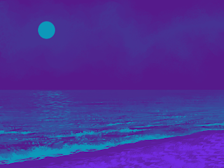
Tonight's piece was painted using only violet, orange, black, and white! Take a look.


This one came out pretty nice looking. I really like the difference in texture between the sky and the sand, I added some of the violet color to the dark orange shadow to make everything a little more harmonious, I think that really helped!

That's all for tonight, check back tomorrow for something new!

Saturday, June 27, 2015

Hey everyone, time for another update!

It's a bit of a diversion from this month's theme, but I thought this it was important enough to post here.


I'm going to admit I didn't have too much time to work on this, but considering recent events I thought it'd be fun to do something to commemorate the Supreme Court of the United States' ruling to legalize gay marriage in America.

That's all for tonight, tomorrow I'll be back to more color studies, check back then!

Friday, June 26, 2015

Hey everyone, time for another update!

Today I have something for you that was painted using only red, blue violet, and yellow orange. Check it out.


I think it's pretty neat. I was trying to make this one look a bit photographic, like if you took a picture and tried to properly expose the sky at sunset, that might leave everything else looking a bit dark. I think the effect turned out pretty well. The sky and water are kind of abstract, but I wanted to have some fun with them, so I guess that's why they turned out that way.

Well, that's all for tonight! Don't forget to stop by tomorrow for something new!

Thursday, June 25, 2015

Hey everyone, it's time for another update!

Today's piece was painted using only blue, green, red, white, and black. Take a look!


I'm really liking the way this turned out. It also kind of contrasts yesterday's post pretty well too, which is pretty funny. I was inspired by the marshlands near where I live, so I decided to paint something like that. The red and green were used to mix the brown color you see under the foliage and water, I also mixed the brown in with the blue and white I used for the sky to make everything relate to each other. I think that really helped to unify the piece.

Well, that's all for tonight. I might want to try something kinda crazy tomorrow as far as color selection, I think it'll be fun to challenge myself a little more! Don't forget to check back for that, see you then!

Wednesday, June 24, 2015

Hey everyone, it's time again for another update!

Monday's post was interesting, and when I say interesting I mean I didn't really care for it. However, I challenged myself to work with those same colors to see if I could come up with something I was happy with. After adding white and black to my available pallet, I came up with something I really like. Have a look!


Kinda pretty, right? Especially when compared to this. I'm really happy with how it looks. I didn't take too much time rendering all the detail, it took about 30 minutes to get this from where I started. I actually sketched everything out and mixed the colors on my iPad when I had spare time before work today, here's what it looked like before I imported it into Photoshop.


I left the sketchlines on top so you could see where I was putting everything. There's really not too much difference between these two, but it's pretty surprising what a few more shades of green and brown can do. Along with some nice texture given by the Photoshop chalk brush!

Well, that's all for today. Check back tomorrow for something new!

Tuesday, June 23, 2015

Hey everyone, it's time for another update!

The three colors I used today were orange, yellow orange, and blue. I mentioned yesterday that I'd be adding white and black to the mix, and I think that really helped. You be the judge, take a look!


I like it! It definitely helped having the black and white in the mix to help me change the brightness of the colors I chose. I left a little of the pure blue underpainting visible since I liked the way it looked, but that's pretty much the only use of unmixed color in the piece.

Since I had such luck with adding black and white today, I think I'm going to give the colors I used yesterday another go. Let's see if that can help me make something that isn't so putrescent looking!

That's all for today. Check back tomorrow for something new!

Monday, June 22, 2015

Hey everyone, it's time for another update!

Today I decided to work in much the same way I did yesterday, using only three colors to create a finished piece. This time my color choice proved to be quite problematic.

Let's start with the colors I picked for today's painting.


Green


Yellow Green


Red Violet

They look kind of neat together, right? That's what I thought until I made this, have a look.


It's very much unfinished, but that's because I felt like there was no saving it. The colors seemed way too saturated to work together, so I decided to try again. That's when I ended up with this.


It was at this point in the painting that I realized I diluted the colors by mixing them together so that they were too desaturated to be interesting. I didn't want to add any pure color back in because it would have just been to bright against the rest of the more neutral hues in the piece. At this point I decided one of the colors needed to go, so I swapped out the green for yellow, and this is what the result looked like.


It's not anything incredibly remarkable, but I'm satisfied with it. It's giving me a very late 80's comic book color vibe, which isn't a bad thing, the subject matter's just not that interesting.

I think for tomorrow's piece I'm going to try to stick to my minimal color theme, but I'll be granting myself the use of black and white. It's going to help me to get what I want out of these pieces, learning about color and relationships between color, but it's also going to help me make a piece that reads a little bit better.

Check back tomorrow for something new!

Sunday, June 21, 2015

Hey everyone, time for another update!

The past few days I've worked with analogous colors, today I did something a bit different and threw a complimentary color in the mix. I'm super happy with the result, check it out.


I love how this piece turned out. I used two colors that were near each other on the color wheel, blue and blue green, and added orange as an accent or complimentary color. I think it could certainly use a bit more work, the figures need to be a little better developed, and I wanted to add a bit more orange into the foreground to give it more depth. Overall it's a pretty successful piece, I definitely think once I give it a little more TLC this will be something to put in my portfolio.

That's all for this update, check back tomorrow for something new!

Saturday, June 20, 2015

Hey everyone, it's time again for another post!

Today's piece is mostly cool, with a nice warm pop of color, have a look!


I love this one! I really like the way the light is scattered in the foreground from the light source in the background, this was a lot of fun to work on.

At first limiting the colors I had at hand seemed daunting, but it's actually helped me to use them more thoughtfully, which is definitely something an artist should be doing.

Well, that's all for this post, check back tomorrow for something new!

Friday, June 19, 2015

Hey everyone, it's time for another update!

Today I wanted to do something that was a little on the cool-warm side, if that makes any sense, so I used green, yellow green, and yellow. Take a look.


I think this one came out pretty nicely. I learned a lesson after I painted my first piece, that being; I mellowed the intensity of some of the colors. Using just a pure yellow was way to aggressive, so I mixed the greens and yellows to varying degrees to get the colors that ended up in the final piece.

Here's a little gif if you're curious about how it all came together.


There you have it! That's all for this post, I hope you enjoyed it. Check back tomorrow for something new.

Thursday, June 18, 2015

Hey everyone, it's time for another update!

Yesterday I painted a scene using warm colors, so today I thought it might be nice to see a painting done in cool hues, take a look.


I really love how this turned out, I only used three colors (just like with my last painting), but it's got a fantastic amount of depth!

I hope you liked this one, check back tomorrow for something new!

Wednesday, June 17, 2015

Hey everyone, it's time for another update!

Since we've now covered the primary, secondary, and tertiary colors in the color wheel, along with seeing how complimentary colors work together, it's time for something new.

These next few posts will be about analogous colors, those are colors which sit next to each other on the color wheel.

I thought it might be fun to start out with some warm colors, so here's how they look in an painting.


Pretty neat right? It's sort of strange seeing a scene rendered within a small range of color like this, but you can still describe all of the elements within that scene as long as you use your colors correctly.

That's all for this post, check back tomorrow for something new!

Tuesday, June 16, 2015

Hey everyone, it's time for another update!

This will be my final complimentary color post, the colors for this evening are yellow green and red violet, take a look!


Kinda looks like a Venus flytrap, I'm totally okay with that.

Check back tomorrow for something new and colorful!

Monday, June 15, 2015

Hey everyone, it's time for another update.

The colors I used today are yellow and violet, what do you think?


I know I said the post from yesterday was my favorite, but I think this one's my new favorite! Check back tomorrow for something new!

Sunday, June 14, 2015

Hey everyone, it's time for a new update!

The colors I used today are yellow orange and blue violet, check it out.


I think this is my favorite one so far! That's all for today though, check out my next post tomorrow.


Saturday, June 13, 2015

Hey everyone, it's time for a new post!

Today's complimentary colors are orange and blue, let's see how it turned out.


Pretty neat! That's all for today, check back tomorrow for something new.

Friday, June 12, 2015

Hey everyone, it's time for a new post!

Today's complimentary colors are red orange and blue green, take a look!


That's all for today, check back tomorrow for something new.

Thursday, June 11, 2015

Hey everyone, it's time for a new post!

Yesterday's post was all about every color, these next few posts are going to be about complementary colors. Complementary colors are colors that are opposite to each other on the color wheel. Speaking of color wheels, here's one for reference.


This image is not my own, it was found on wikipedia, it is being used as a reference only.
So, since the first color I started with was red, I'm gonna keep that going. As you can see, directly across from red is green, that means these will be the colors used in this next piece. Let's see how it turned out!


Pretty intense right? That's because both of these colors used together brighten each other. All of these next few paintings will look this way for that same reason.

That's all for today, check back tomorrow for something new!

Wednesday, June 10, 2015

Hey everyone, it's time for a new post!

So, now that I've covered all of the colors in the red, yellow, and blue color wheel, I thought I'd put together a nice little gif. Here it go.


There you have it, it's all the colors of the rainbow (mostly)!

Don't forget to check back tomorrow to see something new, later!


Tuesday, June 9, 2015

Hey everyone, it's time for a new post!

The first of the secondary colors I posted was green, so that means the last of the tertiary colors I'm posting will be green(ish) too!

Let's see what we've got.


Yellow Green


Blue Green

There you go, that's all of the colors in the RBY (red, blue, yellow) color wheel. I think I might put a little gif together for tomorrow's post. That's all for today, check back tomorrow for something new!

Monday, June 8, 2015

Hey everyone, it's time for a new post!

Friday's post was orange, so since I'm going back down the line it was the next color for me to work on. Here are the tertiary colors next to orange.


Yellow Orange


Red Orange

That's all for this post, the last of these will be tomorrow, don't forget to stop by and see how it turns out then!

Sunday, June 7, 2015

Hey everyone, it's update time again.

Yesterday I mentioned that I thought I'd be putting all of the tertiary colors in one update, that way I could get them all taken care of at once, that's not going to happen though. I failed to remember, which is part of the reason I'm doing this, that for each of the secondary colors there are two tertiary colors! Whoops. That means the next couple of posts will be including two colors each, so let's get down to it then!

Since yesterday's post was purple, here are the two tertiary colors on either side of it!


Blue Purple 


Red Purple

There you have it! Two down, four more to go. Check back tomorrow for more!

Saturday, June 6, 2015

Hey everyone, it's time for another update!

Here's the last of the secondary colors.


It's purple! A good purple too, not quite a "Purple Rain (HEX: 4B308D)," but a good purple. 

That's all for the secondary colors. I think tomorrow's update is gonna include all of the tertiary colors in one post, that way I can get 'em all taken care of in a week.

Check back to see how those turn out!

Friday, June 5, 2015

Hey everyone, it's time for another update!

Here's the second of the secondary colors.


Orange you glad you checked this post out? I am so sorry. Reprehensible jokes aside, I feel like this is the best one yet! I will fully admit to using the marquee tool in Photoshop to create a perfect circle, I feel like that really pushed the sphere in the right direction. I can draw an almost perfect circle on paper, but using a tablet to create one is an entirely different story. I don't think there's a tablet experience yet (excluding the Wacom Cintiq's - but I don't really know 'cause I've never used one) that truly replicate what it's like to draw by hand. That's why the circular marquee tool was that sphere's saving grace.

Well, that's all for this post. Check back tomorrow for something new!

Thursday, June 4, 2015

Hey everyone, it's time for another update.

Today's post marks the start of the secondary colors, and here's the first one.


It's green! I think these shapes are looking better and better each time, I'm still a bit miffed looking at the sphere, but I know I'm gonna have that down by the end of this week.

Don't forget to check back tomorrow to see which color will be next!

Wednesday, June 3, 2015

Hey everyone, it's time for another update!

So since there are only three primary colors, and I've already done two of them, there's only one left. Yellow! Here's how it turned out.


I like it! I think this is the best one yet. I'm really having trouble with the sphere, though it looks better here than in the last two. I'm trying to show it being illuminated by all three of the light sources in the image, and it's altering the core shadow of the form so much that it almost doesn't look round anymore. I'm gonna need to keep working on that. I also took out the sketchy lines around the forms, because they really weren't anything other than a stylistic choice that wasn't working, so out they went! Since I did that with this piece, I thought I'd post the other two without those lines as well, have a look.

Here's blue.


Here's red.


So, there you have it! Red, blue, and yellow. That's all for the primary colors. Next up, the secondary colors! Check back tomorrow to see which one I'll paint first!


Tuesday, June 2, 2015

Hey everyone, here is today's update!

The color of the day today is blue!


Just for the sake of clarity, every new color is repainted in each shape every day. I'm not just making adjustments in Photoshop! I want to render the light on the objects each time, that way I'm improving my ability to describe those shapes. I think tomorrow I'm going to leave those sketch-lines off though, they kind of take away from viewing the color on the forms I think.

That's all for today, check back tomorrow for something new!

Monday, June 1, 2015

Hey everyone, it's the first post of a new month so that means it's time for a new theme.

The last two months were mostly black and white, and while that makes for quick work for me, it's not so interesting for everyone viewing this blog. That's why this month is going to be all about color! For the first week I'll be doing some studies using the primary, secondary, and tertiary colors. After that I'll be doing some drawings using complimentary color, and analogs color schemes.

It's all gonna be a little basic, and it might look a bit amateur, but this sort of thing is super important if you want to develop as an artist. I've always been bad at practicing the basics, and I think that has hindered me for too long, so I'm putting this stuff out there for the world to see. Guess the pressure's on me to do well, here goes!

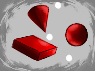
Each day this week I'll be coloring in the following template I made, and using light sources within it to illuminate these shapes which will be rendered in different colors.


Now that you've seen that, here's what I did today!


Today's color was, as I'm sure you can probably tell, red! I tried to render a nice range of values within the shapes, and stayed true to my (limited) knowledge of lighting to make them look somewhat realistic. After all, color is reflected light, in its absence you wouldn't be able to see anything at all! For the sake of keeping things simple, the color of light (because that matters too) in these images will always be white, I'm gonna save that whole 'mixing hues' thing for later.

That's all for today, thanks for stopping by. I wonder what color I'll pick tomorrow? There are only two primary colors left, so you've got a 50/50 chance of guessing and being right! Check back to find out if you were!