This month will be all about studying the composition of master painters! I'll be posting the original image first, then my own version, which will be followed by a short animation to show just how accurate (or inaccurate) I am!
Here's our first piece.

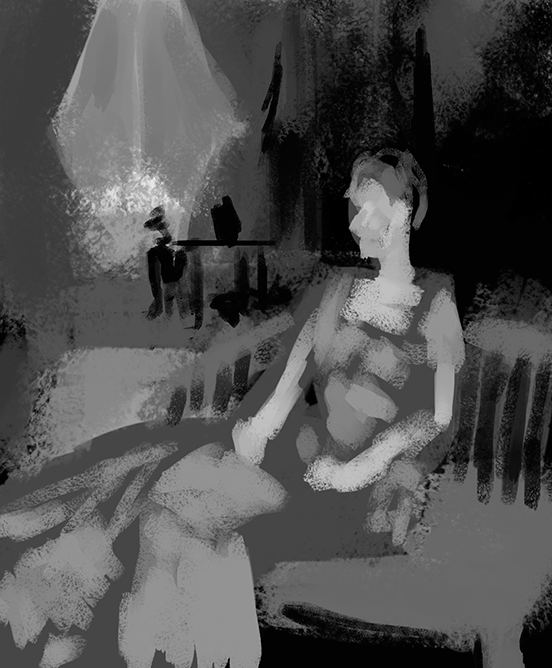
"Mrs. Cecil Wade" - by John Singer Sargent
Absolutely stunning painting, the composition's perfect for this sort of thing! There's so much you can imagine about the subject when looking at an image like this. Alright, let's see how I did.

It's not all that bad, this one was done rather quickly as it has been an extremely long and tiring day, but I'm not too disappointed by it. Right off the bat I can see that the window in the background is much too large, though I like the way the shapes of the table and vase look. The chair back seems a bit too high as it should be level with the closest edge of the area rug. Also, there isn't nearly enough in the way of contrast. It's much too grey. I'm starting to think that's just how my eyes see. I think I'm also struggling with the viewing angle of my monitor a bit, for some reason I almost need to be standing for the image to look right. That's what happens when you use a 4k TV for a make-shift computer monitor. It's awesome, but not without it's drawbacks.
Anyway, here's a neat little animation showing the differences.
(Also, yeah, that's gonna loop into oblivion.)
Looks like my appraisal of my work was pretty spot on, gonna try for more accuracy (and contrast) tomorrow! See you then!
No comments:
Post a Comment