Saturday, March 7, 2015

Hey everyone, here's tonight's post!

Here's what I worked from today.


John Singer Sargent - "El Jaleo"

This one's a real departure from the other pieces I've used as reference, and that's a good thing! I wanted to finish this week of black and white compositions off with something kinda difficult, so that's how I ended up using this painting. There are nine figures total, there's a whole lot of movement, and there are some interesting things going on as far as value goes. Let's take a look and see how I did.


It's not too bad, unfortunately it suffers from being a little rushed, but I'm mostly happy with it. The angle of the dancer's head isn't quite right, and I didn't actually get to paint any of the light areas in on the figures behind her. I think what I'm going to do for the sake of redeeming myself here is give this one another shot at the end of the month. This first week was about black and white, next week's about color, and after that it's gonna be all complete studies. I'll be using this one again so that I can make sure I get it right.

Anyway, it's gif time.


That's all for tonight, check back tomorrow for something new!


Friday, March 6, 2015

Hey everyone, here's tonight's update!

This is what I worked from today.


John Singer Sargent - "Sitwell Family"

I chose this piece to work from today because it's slightly more complex than yesterday's, and the subject matter's still relatively the same. I can definitely see here that the same light to dark technique was used from his "Daughters" painting in this piece (as far as the background is concerned). Though there's a really interesting relationship, or a lack there of, with the arrangement of the figures. The matriarch is on the right, with her children and a small dog at her feet. They're all very bright, and focus pulling, where as the older daughter and her father (I would assume), are quite separate. Either side of the image could be it's own distinct painting. That's the neat thing you get from looking at work like this, whether the family wanted him to or not, there's certainly a story being told in this image. Anyway, let's see how I did.


Not too bad. I think this one shows a little bit of an improvement from yesterday's work. Everything seems roughly closer to where it should be, the contrast's a little better, and the overall size of the figures within the composition is markedly more accurate. This was not however, how the image originally looked. It needed a little tweaking before it got to this point. You can check out the not-so-great version below.


Pretty interesting what a few brush strokes can do, right? I'm much happier with the tweaked version.

Here's the animated version of the good image transitioning into the reference painting.


That's all for tonight, check back tomorrow for something new!


Thursday, March 5, 2015

Hey everyone, time for another update!

Here's the image for today.


John Singer Sargent - "The Daughters of Edward Darley Boit"

This piece is absolutely fantastic, it's much tighter and less experimental than "Rosina," the image I worked from yesterday. These four little girls look alive, as if they're waiting behind the screen, becoming you to come through. The image has this really great contrast shift, the bottom left's bright, and the top right's dark. It's like there's this diagonal gradient from white to black that evenly divides on part of the image from the other. Another interesting thing is the grouping of the girls, they all fit in a little box, if you will, and the whites of their clothes pop out perfectly against the background. Every part of this image has a relationship to every other part, it's really marvelous. Let's see how I did.


The girls in the background are a little too tall, the girl on the rug isn't quite in the right spot, and the angle of the screen next to the large urn on the right is way off. That might sound scathing, but I'm not upset about it. Seeing things like this tell me I'm improving my ability to analyze my work, and the work of other artists, and that's what this whole things about. So it's cause for celebration! I should work harder on getting the next one right though. 

Anyway, choosy moms choose gif.


That's all for today, check back again tomorrow for another update!

Wednesday, March 4, 2015

Hey everyone, it's that time again!

Here's the image I worked from today.


"Rosina" - John Singer Sargent

This one's really interesting because it's much looser stylistically then the other paintings I've worked from before. There's a lot of detail that's implied, and on top of that the construction of the painting itself is a bit odd. The darkest point in the painting is the woman's face, yet there's really nothing there that's light to bring out her features, save for a small sliver on the cheek furthest from us. On top of that the background behind her head is also quite dark, which draws your eye downward, this leads to her sleeve. It's quickly done (I would think), and lovely. Her hand is perched palm out on her hip, and is roughly as dark as the corset it appears she's wearing over this flowing blouse. This sort of leads your eye towards the garlic she has strung over her shoulder, which pulls you back up toward her head and then around to the whitest part of that puffy sleeve. The next point of high contrast from there is the apron tied to her waist, there's this small swatch of black meeting the bright white sleeve. This takes you down further, following the folds of the apron. There's an incredible amount of movement your eye can do along this very, seemingly simple, painting. It's almost like when you see a beautiful person walking across a street and you try and take in all of their appearance at once. You never quite capture it all, it's fragmented because your eyes are frantically describing what they see to your brain. Or at least that's how I look at this. Anyway, on to what I did!


I actually like this one a lot, much more than yesterday's, that's for sure. I didn't quite get the darkness of the value behind her head right. It's much darker than I initially thought. I'm not working from black and white versions of the images, I'm looking at them in color to practice discerning the different values myself. That makes it a little tougher, but I think it's worth it. Her proportion's aren't perfect, but they're much better than what was in my last post. Also, I didn't fret over the details too much, there weren't really all that many to worry about anyway.This wasn't my first stab at this image though, so it took two tries to get right. I'll show you the first one in a second, but first, gif time!


Not too shabby, now, here's something shameful.


Ugh. Too short, leaning too far forward, too hippy, too bad. Oh well, least I fixed it, right?

That's all for tonight, look for a new post tomorrow!

Tuesday, March 3, 2015

Hey everyone, update time!

This is the image I worked from today, check it out.


"Young Man in Reverie" - John Singer Sargent

This is another gorgeous painting, the contrast here is fantastic. It leads your eye right to the form of the man. Though the background is well rendered, you can really see that the focus rests squarely on the youth. So, let's see how I did.


Eh, it's okay. It's not great. I'd mark this as the worst of the week so far. Le't s break it down. Firstly, his face is pretty terrible. I think my problem in that regard was I painted this image at a really low resolution, so I couldn't get any detail in there. On the other side of that coin, I wanted to keep this one small because I felt like yesterday I rendered the image too much, and kinda lost the "study" part of this whole venture. Moving on from the face, the value of the shelf the vases are sitting on is much too dark, and the vases themselves are pretty slapdash. The wall-hanging in the background isn't terribly offensive, but it's not really well defined. In short, this one was hard!

Here's a little giffy gif.


(Yeah, it's not my best work. :/)

That's all for today, check back tomorrow for something new!

Monday, March 2, 2015

Hey everyone, it's time for another update!

I didn't mention it last time around, but for this first week I'll be doing studies in black and white exclusively. The week after will be color studies, and the week after that will be full studies, color and composition. So I'll be covering a couple of different things this month to keep it interesting. Anyway, on with the show!

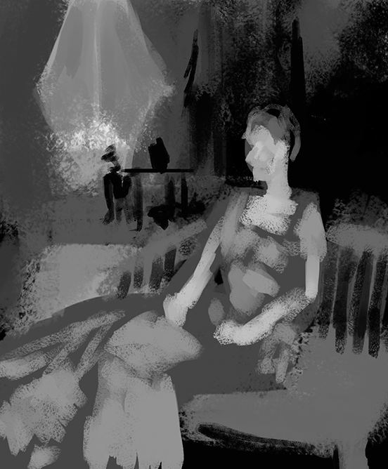
Here's the piece I worked from today.


"A Bedouin Arab" - by John Singer Sargent

Mr. Singer Sargent's gonna be my go-to guy for this week. Though the color he uses is wonderful and expertly chosen, when I look at these pieces that's the last thing that jumps out at me. The differences in value is used so deftly that all of these paintings could be in black and white and not loose any of their impact. Alright, on to what I painted!


I'm actually surprised and impressed with how well this turned out, I'll elaborate a little more on why in a moment. Let's get down to the critique first. The folds on the fabric around the head look great, the ones below a little less so. They're not quite in the right spot, but they're close enough for me not to be too upset. The one glaring issue is that his head's sitting just a little bit lower than in the original image, so that's a bit of a problem. Other than that, this one's pretty solid. I'm slightly concerned about how much work I did though, because a composition study should just include shape and value. I feel like this might be a little too finished for what I'm aiming to do. Oh, well. It looks nice, so I'm happy about that. Now, back to why I was surprised and impressed. This is actually my second attempt at this piece, and it's way, way, way, way, better than the first. I'm gonna put that down below for your amusement (and also to shame myself into never doing this so poorly again).


Not great, not really great at all. Kinda hate it. Hate it less now, so I guess it grew on me? I don't really know, but here it is.

Who wants to see a fun little gif? You do! That's right! Here it is.


(Kinda looks like he just saw something he didn't like and his expression changed.)

Added bonus animation! Here's the one I didn't like.


(The position of the cloak isn't too bad here, I guess I'm just hatin' on the face.)

This was a pretty long post, I hope you enjoyed reading. Check back again tomorrow for another update!

Sunday, March 1, 2015

Hey everyone, it's time for the first update of March! Ready for something new? I know I am!

This month will be all about studying the composition of master painters! I'll be posting the original image first, then my own version, which will be followed by a short animation to show just how accurate (or inaccurate) I am!

Here's our first piece.


"Mrs. Cecil Wade" - by John Singer Sargent

Absolutely stunning painting, the composition's perfect for this sort of thing! There's so much you can imagine about the subject when looking at an image like this. Alright, let's see how I did.


It's not all that bad, this one was done rather quickly as it has been an extremely long and tiring day, but I'm not too disappointed by it. Right off the bat I can see that the window in the background is much too large, though I like the way the shapes of the table and vase look. The chair back seems a bit too high as it should be level with the closest edge of the area rug. Also, there isn't nearly enough in the way of contrast. It's much too grey. I'm starting to think that's just how my eyes see. I think I'm also struggling with the viewing angle of my monitor a bit, for some reason I almost need to be standing for the image to look right. That's what happens when you use a 4k TV for a make-shift computer monitor. It's awesome, but not without it's drawbacks.

Anyway, here's a neat little animation showing the differences.


(Also, yeah, that's gonna loop into oblivion.)

Looks like my appraisal of my work was pretty spot on, gonna try for more accuracy (and contrast) tomorrow! See you then!